Monday 2 July 2012

2012 FINALS BLOG


This blog contains pricture material and information on the collection items of the 2012 graduates of the department of Product Design Artez Arnhem.


For pictures and information on the collection items of the 2013 graduates see: 

http://productdesignarnhem2013.blogspot.nl/ 


Milou van den Berg

Collection: Fashion Pitch


Design vision
My collection of wearable ladies sneakers is derived from my research on the relation between sports and fashion. I focused on the aesthetic image of a sports sneaker to create a fashion sneaker. As a shoe designer I try to bring the worlds of fashion and sports together.  What is important to me is to approach the well-known sneaker in a new way by making an unconventional use of materials, techniques and closures and by rethinking the use of colours. 


Born: 1990 Zeist NL

Milou was an intern at Macintosh Retail group/Trends and Styling and had an extra training Artisanal Shoe Making at the Dutch health Tec Academy
Contact and information:

Research and Inspiration
In the second year of my studies here in Arnhem I attended a workshop of two members of the design staff of the Spanish shoe firm Camper. Students were asked to design a flat heel shoe. For this workshop I took the sneaker and the traditional brogue as sources of inspiration and tried to mix them. Combining and mixing different spheres of style is something I like, a field of research and inspiration I'm still exploring, also for my graduation project. I want to be a commercial designer, making wearable shoes that look good and sell. My ambition is to work for a company at the development department for techniques and materials.
I generally start my research by drawing with an illustrator program.  The next step is to make samples of materials such as lycra and mesh. Then I start drawing by hand, because for me drawing by hand is a way to think and to come to a clear understanding of what I am doing. This all ends with a series of prototypes. For the shoes of my Fashion Pitch collection, inspired by sports and fashion, I predominantly made use of fabrics, restricting the use of leather to certain details. It’s the fabrics that dominate my collection of new looking sneakers.

Eric Hullegie


Collection: The Shoe Factory Revised


Design vision
How can you change and redirect an existing process in order to change the products that are its outcome? How can you use existing processes for purposes they haven’t been designed for?  That’s what matters to me. My focus is not on designing finished products or on mastering or applying known artisanal skills. Instead I concentrate on ways of production. For this reason I cooperated with the Spanish shoemaker Camper, not being a trained shoemaker myself.  It was my aim to have the people of Camper do what they are best at – making shoes according to longstanding technical standards and procedures - and at the same time add something of my own by interfering with the process of production. In this way I cleared the ground for new results in terms of construction, the use of different techniques, materials and forms.
Today’s circumstances in my opinion make it more necessary than ever to take a closer look at different possibilities with already existing means and resources, a topic returning in the second part of my graduation. Changing and speeding up the application of new and conventional production processes to new ends play a key role in this second collection.

Born: 1989 Nijmegen NL
Eric was an intern at Camper
Contact and information:
eric@erichullegie.nl

www.erichullegie.nl


Research and Inspiration
I started working with leather and shoes in the second year of my studies. I like leather as a material. It’s soft and easy to mould. Yet, what interests me is not the shoe as a fashionable item. I focus on finding new ways of making them, and more in general I focus on innovating processes by which products are made. In Spain, while I was an intern at Camper on the island of Majorca, I started a series of experiments with lasts that are the basis of shoe production.  I cut them up, reassembling men’s lasts and women lasts.  Right now I’m combining a roll of lycra with sheets of plastic netting. The lycra has a gradual changing colour print. With the aid of a last I mould the lycra and gaze combination in a vacuum machine. It’s a simple and unconventional process for the production of shoe uppers, each shoe having a different look thanks to the different colour prints.

Thor ter Kulve


Collection: Redefine Our Public Space


a: Fountain
b: Fireside
c: Lamp
d: Swing


Design vision
For my graduation I designed a collection of products that reshapes and redefines our public space. By using well known products I want to show what is possible with what already exists. Simply attaching a bell to a lamppost transforms it into a landmark. More or less the same idea inspired my design for a fireplace insert, attachable to Holland’s most wide spread public trashcan. Thanks to this design dull and derelict places become hangouts of choice and to the same object I designed an attachment that makes a fire post into a fountain. It’s my strong belief that in a time of economic hardship and individual isolation we should address ourselves to public space as a collectively owned domain and possible ways to use it to our joint benefit.

Born: 1990 Amsterdam NL
Thor was an intern at Floris Schoonderbeek
Contact and information:
Research and Inspiration
The term public space somehow suggests that urban environments are open to our free use. The reality is that public space is over regulated. There is little room for free use, no room for play. A serious obstacle is zoning or urban planning with the attached discussions on what is permissible where and the ambition to regulate on this for the long run. To make public space free and a life again I propose temporary intervention making short term use of the plastic possibilities of specific places.
I do not think or work in terms of finished products that would add a nice look. What triggers me is a specific site that somehow asks for an idea, a plan to make use of its features. A place can invite you to play with the idea to install a swing just to have a look at the adjacent river. Likewise a rather boring street can invite you to think of possible way to do something about it.
My first steps in working out idea’s is sketching and making a mood board. In my mood boards I bring together imagery concerning the intervention I’m planning and the object or product that plays a key role in this intervention. The next step is making a prototype. Once I have this prototype I start refining it in terms of aesthetics and functionality.


Vera Meijwaard


Collection: Renaissance of The Abundance


Design vision
Virgin Mary embodies the perfect dream. Inspired by the cult of the virgin I designed a collection of shoes that has the idea of ​​hyper-decoration and transformation as a common denominator. By translating elements of her cult into a new visual language, I express my desire for its bygone splendor. Design to me is an artistic expression, in no way reconcilable with concessions aimed at functionality. My shoes are meant as a source of inspiration comparable to what haute couture is to fashion.

Born: 1988 Naarden NL
Vera was an intern at Viktor & Rolf and had an extra training as an Artisanal Shoe Maker at the Dutch health Tec Academy
Contact and information:
info@verameijwaard.nl

Research and Inspiration
What triggers me is image. From an early age on Roman Catholic imagery enchanted me. I have always been attracted to glitter, and with the Catholics glitter is what you get. It’s a multi layered way of storytelling that somehow makes it convincing. Last year I started my research on the portrayal of the Virgin Mary. I focussed on the 4 issues: halos, the interaction between the Virgin and the Holy Spirit depicted as a dove, the use of flowers in relation to Mary and vows gifts. How to translate these features into a contemporary vocabulary? I used some of the curves of the depicted doves as a starting point for the shape of my shoes. By cutting, sampling, mirroring and rotating details of contemporary images of Mary I found the material for my prints. I make sketches, but at soon as I know what I want I start making it.


Jasper Nijs

Collection: Experience Expert


a and b: lemon squeezer
c,d,e, f and g: coffee grinder
h, i, j, k and l: nut cracker

Design vision
My collection is made up of products that direct attention to everyday life. My focus is on functionality, a subject I chart by giving an obsessive and ritual twist to daily routines. My products make a play out of grinding, pressing and cracking. I impart a neurotic aura to routines like this by designing tools that enlarge them to the absurd. Playing with your food becomes a new sensational experience in which overkill plays a dominant role.

Born: 1990, Nijmegen NL
Jasper was an intern at design label Vij5
Contact and information:
jaspernijsdesign@gmail.com


Research and Inspiration
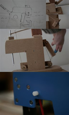
It started with a small research I did on the relation between design and functionality. It’s a known fact that products with a super functional design do not always function as well as they look. This rather amusing conclusion brought up the idea to do it the other way. What if you would design an item with faultless functionality as your main objective, an approach that is not common in household products? The first faultless item that came up to my mind was a nut cracker. I like to eat walnuts. What keeps me from doing so in most cases is the fact that cracking a nut leaves you with a multitude of shell and nut fragments, a thing I deeply abhor. So I decided to make a nut cutter that would split a walnut in no more than two halves, time and time again, with no mess of fragments. I succeeded in doing so. The result of my work is a nut cracker or splitter of 8 kilo, made op 5 mm steel plate. It doesn’t fail. Never! You could compare it to a house wife bringing her children to school in a Hummer. It’s a case of overkill, a machine that goes beyond the reasonable. Yet it is fun. Machines like this, with an exaggerated functionality, focus attention on the experience of its immaculate operation.  It’s a conversation piece, something to amaze and amuse your friends and visitors and the same applies to my coffee grinder and lemon press. The first has a hard stone grinding wheel, speeded up by a special pump, and a slide by which the coffee beans are transported to the grinding wheel one by one to be irretrievably smashed.  The second is based on the mechanics of an old style swing press and squeezes an orange in only one movement not leaving a single drop behind.  Research to me is observing, analysing and thinking in the first place.  The next step is making models initially working with hard board, strings and glue. Then I start calculating and drawing as a step towards building a prototype.  In the end my collection is a proof I’m worth something in the field of design. I‘m able to see what’s going on in design. My products fill a gap and heighten the understanding of design as a human endeavour.


Mick van der Pluijm

Collection: ShowOff


a, b and c: Thistle
d, e and f: Rooster
g and h: Man
i and j: Woman
(production titles)


Design vision
Classic porcelain epitomizes to me what I feel lacking in today’s world: class, excess, luxury and wealth. With the past in the back of my mind I look for these qualities in the present. One of my objects of study is traditional table ware. With the chopped up pieces I build new entities. The result is a series of show pieces that flirts with yet another past: the language of Memphis that came to the front in the eighties of the last century.   If only for its smug, cocky and obtrusive aura, Memphis as a design movement is of mayor importance today. It’s time to do it all over again, this time better.

Born: 1989 Raamsdonk NL
Mick was an intern at Studio Lenneke Wispelwey
Contact and information:
info@studioknockout.nl
www.studioknockout.nl


Research and Inspiration
My research starts with observation, thinking and drawing. I do all my drawing with my computer. My graduation collection originated in the discussions I had with my teachers. They said I had a propensity towards the classic, alleging this was somewhat odd. Were they right? I like the classic, but always in combination with the modern. At one point during all these discussions I decided to turn the putative oddity of my taste to my advantage and to make full use of it. I started to deconstruct classical flower decorations that can be found on  porcelain to the point where I transformed them into assemblies of coloured squares. These deconstructions are the starting point for my research on colour and the use of colour in my designs.  In a similar way I deconstructed the forms of household and kitchen tools. The result was a set of shapes and curves I use as a basic vocabulary for shaping my chandeliers and lighting applications.